# emoji-picker-react — complete documentation
> Emoji picker for React: batteries included with ``, or BYOD (bring your own design, design language and design library) with `unstyled` and `emoji-picker-react/primitives`. Both paths share search, keyboard navigation, localization and virtualization. Use your existing Tailwind, shadcn/ui, CSS Modules, Emotion, styled-components, MUI or plain CSS design.
> Generated by `npm run docs:llms`. Do not edit by hand.
Key facts:
- Install: `npm install emoji-picker-react`. Minimal use: `import EmojiPicker from 'emoji-picker-react'; insert(e.emoji)} />`.
- Choose batteries included or BYOD for both "I just need an emoji picker" (the default component needs no styling) and "it must match our design system" (`unstyled` or primitives + the project's styling solution).
- Entry points: `emoji-picker-react` (the default picker, enums and types; registers the English dataset), `emoji-picker-react/primitives` (composable parts, hooks, tokens and the same enums; loads the dataset on demand), `emoji-picker-react/data` (search and lookup without React), `emoji-picker-react/data/emojis-` (28 datasets). The complete export list is below.
- Styling: `--epr-*` CSS variables (they always yield to consumer CSS), `[data-epr-part="…"]` selectors, `className`/`style`. Ordinary resets are handled by library classes; more specific rules and !important can still override structural geometry. With Tailwind v4 or other @layer setups pass `cssLayer="epr"` and declare `@layer epr, theme, base, components, utilities;` first.
- Use `colorScheme="light" | "dark" | "auto"` on Root, or prefer it over `theme` on EmojiPicker (CSS-in-JS wrappers reserve `theme`). Props accept string literals or enums.
- Accessibility: automated axe and keyboard/focus regression checks; grid semantics (emoji buttons are `role="gridcell"`); every UI string localizable through `labels`. Manual screen-reader verification has a separate release protocol.
- Works with React 16.8–19, SSR, React Server Components (client entries are marked "use client"), TypeScript.
- Composition owns presence and placement: Root renders exactly the parts you supply — omit Search, Preview, SkinTone, Panel or Reactions to omit that UI, and place SkinTone inside Search or Preview (or anywhere in Root). The default picker assembles the same parts from its legacy props. Use SearchInput as={Input} with an input-forwarding adapter. Root/EmojiPicker components replace Emoji, CategoryHeader, CategoryButton, SkinToneButton, ClearButton and ExpandButton; List components override grid slots. Use useSearchActions, useCategoryNavigation and usePickerMode for custom controls. Bare Root and unstyled remove all branded decoration; geometry and presence belong to your JSX. Do not invent asChild, onEmojiSelect or a renderer-independent UI engine.
- Read the installed package llms-full.txt first; it matches the installed version. The primitives entry, `unstyled`, `columns`, `components`, `labels` and loader `emojiData` exist from 5.0.0; a 4.x installation has only the v4 props.
- Do not override structural layout (viewport overflow, grid geometry); position the picker by wrapping it.
Exports (generated from the entry sources):
- `emoji-picker-react`: default `EmojiPicker`; values `Categories`, `Emoji`, `emojiByUnified`, `EmojiStyle`, `SkinTonePickerLocation`, `SkinTones`, `SuggestionMode`, `Theme`; types `CategoryButtonRenderProps`, `CategoryConfig`, `CategoryHeaderRenderProps`, `CategoryIcons`, `CustomEmoji`, `EmojiClickData`, `EmojiClickHandler`, `EmojiData`, `EmojiDataInput`, `EmojiDataLoader`, `EmojiDataLoaderOptions`, `EmojiRenderProps`, `EmojiStyleValue`, `ListComponents`, `ListEmoji`, `OnEmojiClickApi`, `PickerComponents`, `PickerLabels`, `PickerProps`, `PreviewConfig`, `Props`, `SkinToneButtonRenderProps`, `SkinToneChangeHandler`, `SkinTonesValue`, `SuggestionModeValue`, `ThemeValue`.
- `emoji-picker-react/primitives`: values `Categories`, `CategoryNav`, `darkPickerTokens`, `defaultPickerTokens`, `EmojiStyle`, `Empty`, `lightPickerTokens`, `List`, `LoadError`, `Loading`, `Panel`, `Preview`, `Reactions`, `Root`, `Search`, `SearchInput`, `SkinTone`, `SkinTonePickerLocation`, `SkinTones`, `structuralPickerTokens`, `SuggestionMode`, `Theme`, `useActiveEmoji`, `useCategoryNavigation`, `useEmojiDataState`, `usePickerMode`, `useSearchActions`, `useSearchState`, `useSkinTone`, `Viewport`; types `CategoryButtonRenderProps`, `CategoryConfig`, `CategoryHeaderRenderProps`, `CategoryIcons`, `CategoryNavProps`, `CustomEmoji`, `EmojiClickData`, `EmojiClickHandler`, `EmojiData`, `EmojiDataInput`, `EmojiDataLoader`, `EmojiDataLoaderOptions`, `EmojiDataState`, `EmojiRenderProps`, `EmojiStyleValue`, `EmptyProps`, `ListComponents`, `ListEmoji`, `ListProps`, `LoadErrorProps`, `LoadingProps`, `OnEmojiClickApi`, `PanelProps`, `PickerAppearanceProps`, `PickerComponents`, `PickerCompositionProps`, `PickerLabels`, `PreviewConfig`, `PreviewProps`, `ReactionsProps`, `RootBehaviorProps`, `RootProps`, `SearchInputComponent`, `SearchInputElement`, `SearchInputProps`, `SearchProps`, `SearchState`, `SkinToneButtonRenderProps`, `SkinToneChangeHandler`, `SkinToneProps`, `SkinTonesValue`, `SuggestionModeValue`, `ThemeValue`, `ViewportProps`.
- `emoji-picker-react/data`: values `getEmojiByUnified`, `searchEmojis`; types `EmojiData`, `EmojiDataOptions`, `EmojiInfo`.
- `emoji-picker-react/data/emojis-`: default export, an `EmojiData` dataset (bn, da, de, en, en-gb, es, es-mx, et, fi, fr, hi, hu, it, ja, ko, lt, ms, nb, nl, pl, pt, ru, sv, th, uk, vi, zh, zh-hant).
Quick reference:
```tsx
// Batteries included: theme the built-in look with colorScheme and --epr-* variables.
import EmojiPicker from 'emoji-picker-react';
insert(e.emoji)} />
// Unstyled: same layout and behavior, your CSS on [data-epr-part] selectors (color variables do nothing here).
// Composed: your layout, your components; Root keeps state, keyboard, ARIA and virtualization.
import * as Picker from 'emoji-picker-react/primitives';
insert(e.emoji)}>
// Data only (no React): search and lookup.
import { searchEmojis, getEmojiByUnified } from 'emoji-picker-react/data';
searchEmojis('party'); getEmojiByUnified('1f389'); // { emoji: '🎉', name: 'party popper', unified, names, … }
```
Contents:
1. Agent integration guide (docs/v5/AGENT_GUIDE.md): installed-version discovery, batteries included/BYOD, typed input/cell contracts, localization and verification
2. Copyable integration prompts (docs/v5/PROMPTS.md): setup, brand styling, design-library composition, recipe adoption and v4-to-v5 migration
3. README (README.md): overview, quick start, choosing a path, styling with any solution, common tasks
4. Props reference (PROPS.md): every prop of the default
5. CSS variables (CSS_VARIABLES.md): every --epr-* design token
6. Customization (CUSTOMIZATION.md): custom emojis and groups, category icons, preview, CSP nonce
7. Internationalization (INTERNATIONALIZATION.md): locale datasets and labels
8. Adoption (docs/v5/ADOPTION.md): native input, loading recovery, registry installation and source downloads
9. v5 API (docs/v5/API.md): all v5 additions with examples
10. Primitives (docs/v5/PRIMITIVES.md): composable parts, hooks, custom cells, grammar
11. Styling (docs/v5/STYLING.md): tokens, parts, cascade, structural rules
12. Styling recipes by library (docs/v5/STYLING_RECIPES.md): theme, unstyled and composed snippets for plain CSS, CSS Modules, Tailwind, shadcn/ui, Emotion, styled-components and MUI
13. Data API (docs/v5/DATA_API.md): framework-free search and lookup
14. Migrating from v4 (docs/v5/MIGRATION.md): what changed and how to upgrade
15. Website examples (website/README.md): typed customization, locale loading and composition
16. Design recipes (stories/recipes/README.md): 25 designs, each in seven styling stacks
17. Styling integrations (stories/integrations/README.md): shadcn/ui, Tailwind, Emotion, styled-components, CSS Modules, CSS, MUI
18. Example app (example/README.md): Vite + React 19 app running the batteries-included, unstyled, composed and data-API paths
19. Worked example: team chat picker composition (stories/recipes/team-chat/picker.tsx; picker only, demo app chrome excluded)
# Integrating emoji-picker-react: agent guide
A decision-first guide for coding agents and the people reviewing their output. Every snippet here matches the shipped API.
For a task to paste into a coding agent, use the [setup, customization, recipe
adoption and v5 migration prompts](PROMPTS.md). Each is self-contained and
starts with installed-version discovery; the contracts below remain authoritative.
## 1. Check the installed version first
Everything below exists from `emoji-picker-react@5.0.0`. A 4.x installation has the same default `` but none of the v5 additions.
1. Read the app's `package.json`, lockfile, and `node_modules/emoji-picker-react/package.json` (`version`, `exports`).
2. Read `node_modules/emoji-picker-react/llms-full.txt`: the full reference for that exact version, usable offline. `llms.txt` is a short index.
3. If the installed version is 4.x, use only v4 APIs (no `/primitives`, `unstyled`, `columns`, `components`, `labels` or loader `emojiData`), or upgrade: [MIGRATION.md](MIGRATION.md) lists every behavior change.
## 2. Pick a path
| The app needs | Use | The app styles | The picker owns |
| --- | --- | --- | --- |
| An emoji picker, fast | `` | Nothing | Complete UI and behavior |
| The built-in look in brand colors | `` + `colorScheme` + `--epr-*` color variables | Variables | Complete UI and behavior |
| Its own design, supplied layout | `` | Every part, via `[data-epr-part]` | Layout, geometry, behavior |
| Its own layout or design-library components | `emoji-picker-react/primitives` | Layout and parts | State, grid, keyboard, ARIA, virtualization |
| Search or lookup without UI | `emoji-picker-react/data` | Everything | Dataset search and lookup |
BYOD means **bring your own design, design language and design library**. It works with plain CSS, CSS Modules, Tailwind, shadcn/ui, Emotion, styled-components and MUI.
**The styling rule.** Color variables (`--epr-bg-color`, `--epr-highlight-color`, …) theme the *built-in look*. `unstyled` and a bare `Root` remove the built-in look, so color variables do nothing there. Size variables (`--epr-emoji-size`, paddings, heights) work in every mode. To reuse the built-in look in a composition, pass `appearance="default"` to `Root`.
## 3. Batteries included
```tsx
import EmojiPicker from 'emoji-picker-react';
insertAtCaret(data.emoji)}
/>
```
`insertAtCaret` is your application's function. The host owns insertion, trigger state, placement and popover/dialog dismissal. Preserve the text selection and any suffix when inserting. For custom image emojis, `data.emoji` is the custom id; map it to your token or attachment. Search and selection never send messages.
## 4. BYOD with design-library components
```tsx
import * as React from 'react';
import * as Picker from 'emoji-picker-react/primitives';
import { Input, Button } from './design-system';
function Cell({ emoji, ...managed }: Picker.EmojiRenderProps) {
return (
);
}
const components = { Emoji: Cell };
const loadFrench = () => import('emoji-picker-react/data/emojis-fr');
function ComposerPicker({ onSelect }: {
onSelect: (data: Picker.EmojiClickData) => void;
}) {
return (
);
}
```
Adapt `Input` and `Button` props to the installed design library.
**Inputs.** `SearchInput as={Input}` infers `Input`'s own props, including required ones. `Input` must forward the supplied props and ref to a native ``. Root owns the value: use `searchValue` / `onSearchChange` on Root, never `value`, `defaultValue` or a second controller on SearchInput. Libraries whose ref lands on a wrapper (MUI `TextField`) need an adapter: `inputRef` for the ref, `slotProps.htmlInput` for native props. See the copyable adapter in [ADOPTION.md](ADOPTION.md#inputs-with-a-wrapper-ref-including-mui).
**Cells, headers and controls.** `components` on Root or EmojiPicker replaces `Emoji`, `CategoryHeader`, `CategoryButton`, `SkinToneButton`, `ClearButton` and `ExpandButton`. Each receives managed props plus metadata: `emoji` (with `isActive`), `category` (with `isActive` on buttons) or `tone`. Remove the metadata and spread **all** remaining props, including `className` and the inline position `style`, onto one native element. Keep component identities stable (define them at module scope). Add a visible focus style. Design-library buttons often need `minWidth: 0` and compatible padding to fit the managed cell.
**Custom UI from hooks** (inside Root): `useActiveEmoji()` for previews, `useSkinTone()` for tone menus (respects controlled `skinTone`), `useSearchState()` (read-only) and `useSearchActions()` (`setValue`, `clear`) for search UI, `useCategoryNavigation()` (`categories`, `activeCategory`, `jumpToCategory`) for tabs, `usePickerMode()` (`reactionsOpen`, `expand`, `collapse`) for reactions, `useEmojiDataState()` (`loading`, `error`, `retry`) for loading UI.
## 5. Composition grammar
- One `Root` per picker. One `Viewport` containing one `List`. Wrappers, memo and HOCs around parts are fine.
- `Search` (input + icon + clear button) and `SearchInput` (only the input, or yours) are alternatives: use one.
- Optional parts: `CategoryNav` (`orientation="vertical"` for rails), `Preview`, `SkinTone`, `Empty`, `Loading`, `LoadError`. Search and Preview never insert SkinTone automatically; place it directly where needed.
- Root renders exactly the supplied children. For compact reactions, place `Reactions` outside `Panel` and put expanded parts inside `Panel`. Put layout props directly on Panel; there is no composition switch or panelProps prop.
- Conditionally mount Root to control its lifetime; unmounting aborts pending loading and discards picker state. The assembled EmojiPicker keeps its legacy `open` prop, which, as in v4, keeps search, skin tone and reactions mode while closed.
- Portaling a whole Root (into a popover) works; portaling individual parts out of Root does not.
## 6. Mistakes to avoid
| Don't | Do |
| --- | --- |
| `unstyled` + `--epr-bg-color` and expect a themed picker | Theme the default picker with variables, or style `[data-epr-part]` selectors under `unstyled` |
| Bare `Root colorScheme="dark"` and expect dark controls | `Root appearance="default" colorScheme="dark"` |
| `import { Categories } from 'emoji-picker-react'` in a primitives app | Import enums from `emoji-picker-react/primitives`; the main entry bundles the English dataset |
| Invent `asChild`, `onEmojiSelect`, `render` props, children inside `List`, or setters on `useSearchState` | Use `components`, `onEmojiClick`, and the action hooks above |
| `value` / `onChange` on `SearchInput` to control search | `searchValue` / `onSearchChange` on Root |
| Drop `style` or `className` from a custom cell | Spread every managed prop onto the native button |
| `stopPropagation` to block selection | `onEmojiClick` is the selection callback; filter there |
| Query cells with `getByRole('button')` in tests | `getByRole('gridcell', { name: 'grinning face' })` |
| A bare `Root` with no height | Give Root a height (`style={{ height: 400 }}` or a class); otherwise every emoji renders at once and development builds warn |
| A new loader function on every render | Hoist the loader to module scope; a new identity means a new dataset |
| Hide the default focus ring on custom controls without a replacement | Provide `:focus-visible` styles |
## 6a. Types
Import types from the entry you use: `EmojiClickData`, `EmojiClickHandler`, `PickerLabels`, `CustomEmoji`, `PreviewConfig`, `PickerComponents`, `EmojiRenderProps`, `EmojiDataLoader` and the literal unions (`ThemeValue`, `EmojiStyleValue`, `SkinTonesValue`, `SuggestionModeValue`) come from both `emoji-picker-react` and `emoji-picker-react/primitives`; `RootProps` and the part prop types from `/primitives`; `EmojiInfo` from `/data`. The export index in `llms.txt` is generated from the entry sources and is complete.
## 7. Data, loading and bundle size
Hoist an emoji loader at module scope or memoize it. Loaders receive `{ signal }`; pass it to `fetch`. Rejection and malformed payloads show `LoadError` and set `useEmojiDataState().error`; `retry()` starts another attempt. Source changes, closing and unmount abort old attempts.
The main entry and `/data` register the English dataset synchronously. A composed app that wants the dataset deferred must import runtime values only from `/primitives`. A static locale import is synchronous and SSR-safe; a dynamic loader defers the dataset. The initial JavaScript budget excludes deferred dataset traffic and React.
## 8. Styling details
Per-library snippets (plain CSS, CSS Modules, Tailwind, shadcn/ui, Emotion, styled-components, MUI) for the theme, unstyled and composed paths: [STYLING_RECIPES.md](STYLING_RECIPES.md).
- Target parts with `[data-epr-part]`: `root`, `panel`, `search`, `search-input`, `search-clear`, `skin-tone`, `skin-tone-button`, `category-nav`, `category-tab`, `viewport`, `list`, `category`, `category-label`, `category-content`, `emoji`, `variation-picker`, `preview`, `empty`, `loading`, `load-error`, `reactions`, `reaction`, `expand-reactions`. State: `[data-epr-active]` (hovered or focused emoji, active tab or tone), `aria-selected`, `aria-pressed`.
- Variables yield to any consumer selector (zero specificity). For Tailwind v4, declare `@layer epr, theme, base, components, utilities;` and pass `cssLayer="epr"`.
- Under `unstyled` or a bare Root, give `[data-epr-part='variation-picker']` and sticky `category-label`s a background; they are transparent overlays otherwise.
- Do not override Viewport overflow, cell dimensions, category positioning or the inline cell positions. Change size variables or `columns` instead.
- Root dimensions come from `style`/`className`; EmojiPicker also takes `width` and `height`. With `columns`, the width fits the columns unless set.
- Use `colorScheme`, not `theme`, on components wrapped by Emotion, styled-components or MUI `styled()`.
- `dir="rtl"` mirrors the grid, tabs and tone fan; arrow keys follow the visual direction. Custom cells receive their position as `top` and `insetInlineStart`; spread `style` rather than reading `left`.
- `prefers-reduced-motion: reduce` turns off the library's own transitions.
## 9. Localization and accessibility
Locale datasets translate emoji names and category names. `labels` translates controls and announcements; `previewConfig.defaultCaption` sets the preview caption. Complete localization covers every visible and announced string in your composition: see [INTERNATIONALIZATION.md](../../INTERNATIONALIZATION.md).
Keep the managed ARIA props. Test keyboard selection, search and IME input, focus restoration and nested Escape inside the real host popover or dialog: Escape closes an open variation or tone menu before reaching the host. Custom emojis with duplicate names share an accessible name; scope test queries to a category.
# Copyable setup, customization and migration prompts
Copy a block into your coding agent. Replace the bracketed fields where present;
leave them blank to use your application's existing conventions. Attach a
screenshot or selected recipe's implementation files when asking for a design.
Each prompt includes version discovery so it also works in an existing project.
The prompts target emoji-picker-react 5. A 4.x installation does not provide
primitives, `unstyled`, `columns`, `components`, `labels` or loader
`emojiData`, so each prompt checks the installed version first. The installed
package's `llms-full.txt` describes that exact version.
## Quick setup
Use this when you want a working picker with its built-in appearance.
```text
Integrate emoji-picker-react into this application's emoji entry flow.
Inspect package.json, the lockfile, the resolved package version and exports,
and the installed llms-full.txt. Use the existing package manager and
framework conventions. If the installed version is below 5, upgrade to
emoji-picker-react@5 (or explain why you cannot) before using v5 APIs.
Start with the default EmojiPicker component. It needs no stylesheet import
or primitives. Prefer colorScheme="auto" for v5. Connect onEmojiClick's data
payload to the existing application state. For a text composer, insert
data.emoji at the saved selection, preserving surrounding text and restoring
the caret. Map custom emoji IDs to the application's representation.
The application owns the trigger, popover/dialog, placement and dismissal.
Preserve focus restoration and let picker menus handle Escape before closing
the host. In an RSC application, keep interactive UI in a client component;
use only emoji-picker-react/data for server-side search or lookup.
Deliver the changed files and exact setup commands. Run the application's
existing type/build checks and verify selection, search, keyboard navigation,
dismissal and focus restoration. Report any checks you could not run.
```
## Match my brand
Use this for colors, typography, radii and spacing while retaining the built-in
picker layout. Describe your visual requirements or attach a screenshot.
```text
Customize this application's emoji-picker-react to match:
[brand colors, typography, light/dark requirements, or attached screenshot]
Inspect the installed version, exports and matching llms-full.txt before
choosing APIs; v5 features need emoji-picker-react 5 or later. Preserve the
existing integration, callbacks and state ownership.
Keep the default EmojiPicker and theme its built-in appearance using a scoped
className and documented --epr-* variables. Use this application's existing
styling solution and prefer colorScheme over theme. Keep light and dark text,
backgrounds and focus indicators readable. For Tailwind v4, declare the epr
layer before the application's layers and pass cssLayer="epr".
Use documented size tokens or columns for sizing; preserve viewport overflow,
virtualized cell positions and category geometry. Avoid hashed internal class
names. If changing composition or markup is actually necessary, explain that
choice and use the supported primitives/components contracts.
Deliver the component and styling files, show where each is imported, and
explain how to adjust the colors and dimensions. Check both color schemes,
small containers, keyboard focus and the application's type/build checks.
```
## Build with my design library
Use this when you want your own layout or controls. The styling library field
can name CSS Modules, Tailwind, shadcn/ui, Emotion, styled-components, MUI,
ShipStyles or StyleX. Use the library already configured in the application;
its own version and build setup determine the available styling APIs.
```text
Build an emoji picker matching [design or attached screenshot] using
[styling/design library already used by this application].
Inspect the installed emoji-picker-react version, exports and llms-full.txt,
and the styling library's installed version and existing configuration. Use
documented v5 APIs and real library APIs. Include any necessary setup changes.
Choose the smallest supported approach: theme EmojiPicker for its existing
look, use EmojiPicker unstyled for its supplied layout with my appearance, or
use emoji-picker-react/primitives when I need my own composition or controls.
Color tokens theme the built-in appearance; bare Root and unstyled need part
styles. Root appearance="default" intentionally reuses built-in leaf styling.
For primitives, JSX determines presence and placement. Root renders only its
children. Omit unwanted parts; put SkinTone where it belongs. For compact
reactions, compose Reactions outside Panel and expanded content inside Panel.
Do not add composition, panelProps or legacy visibility switches to Root.
Use SearchInput as with a ref-forwarding input adapter when appropriate.
Keep component identities stable and preserve managed refs, handlers, style,
ARIA and data-epr-* props on the required underlying elements. Preserve
viewport overflow, cell geometry, virtualization and keyboard navigation.
Connect selection, controlled state and host dismissal to the application.
Deliver complete files, dependencies and setup, with checks for search,
selection, focus, Escape, responsive layout and the existing type/build gates.
```
## Adapt a recipe
Attach the selected recipe's source files and specify its styling variant.
The current catalog supplies CSS, CSS Modules, Emotion, styled-components,
MUI, Tailwind and shadcn/ui variants. A variant for another library needs a
real implementation and verification before being described as available.
```text
Adapt the attached emoji-picker-react recipe into this application:
Recipe: [name]
Styling variant: [library]
Integration target: [composer, comment field, status dialog, or other surface]
Read the attached source and inspect the application's installed versions,
package exports and matching llms-full.txt. Keep the recipe's actual picker
composition, interaction behavior and styling in the selected library. Use
documented v5 APIs. If the supplied files do not include the requested variant,
identify that gap and implement it using the installed styling library's APIs.
Replace mock application chrome and state with our real components and data.
Preserve insertion at the saved selection, custom emoji mapping, controlled
state ownership, dismissal and focus restoration. Do not send a message when
an emoji is selected. Preserve library-owned navigation, ARIA, virtualization,
managed props and refs. Primitive presence belongs to JSX.
Deliver all required component, styling and setup files, with exact import
paths and dependencies. Explain the integration points and customization
options. Run the application's existing checks and verify the recipe's
interactive states and light/dark/responsive requirements. Report limitations.
```
## Audit a v4-to-v5 migration
Use this for a review and migration plan before changing application code.
```text
Audit this application's migration from emoji-picker-react v4 to v5.
Produce a file-specific plan before making implementation changes.
Inventory picker imports, resolved versions, props, callbacks, controlled
state, locale datasets, custom emojis, CSS selectors and interaction tests.
Read documentation matching the v5 target version, its package
llms-full.txt, and its migration/API compatibility contract.
Separate required compatibility work from optional adoption of new features.
Keep the default EmojiPicker where it already meets our needs. Existing enums,
theme and useful default-picker visibility props remain supported; primitives
are optional. Prefer colorScheme in new CSS-in-JS integrations.
Call out the native emoji default and platform support filtering; an explicit
emojiStyle="apple" preserves image rendering where required. Audit supported
package subpaths and deprecated locale aliases, changed managed markup/grid
roles, zero-specificity tokens and cascade layers, responsive column spacing,
prop updates after mount, widened enum/literal types, and SSR/client boundaries.
Preserve callback payloads, search/skin-tone ownership and custom emoji IDs.
Return required changes by file, optional improvements separately, behavior
choices needing a product decision, and a verification plan covering types,
search/IME, selection, focus, Escape, localization, themes and representative
platforms. Review intentional visual changes before updating image baselines.
```
## Apply a v4-to-v5 migration
Use this after choosing a target and reviewing the audit. State whether you
want to keep the previous image appearance or adopt native emoji rendering.
```text
Migrate this application to emoji-picker-react v5:
[target version, e.g. latest 5.x]
Appearance policy: [retain Apple images / adopt native emoji rendering]
Approved audit or requirements: [attach or describe]
Inspect the current code, resolved versions and target-version documentation,
including its migration/API compatibility contract and llms-full.txt. Use the
project's package manager and update its lockfile consistently. If the target
cannot be resolved, report that before changing code to depend on it.
Make the required compatibility changes while preserving working callbacks,
custom emojis, locale behavior, host integration and controlled state. Keep
existing supported APIs and use the default picker unless our layout requires
primitives. Preserve Apple rendering with explicit emojiStyle="apple" when
requested; explain native platform filtering if adopting the native default.
Use canonical documented package entries and stable data-epr-part selectors.
Prefer colorScheme when touching styling-library wrappers. If using primitives,
compose presence through JSX and keep Reactions outside the expanded Panel.
Update affected tests to assert public behavior and managed grid semantics:
emoji grid cells use role=gridcell and categories use named rowgroups. Retain
keyboard, search/IME, skin tone, custom emoji, focus-restoration, nested-Escape,
locale and responsive coverage. Check the actual host popover/dialog and SSR
path. Review visual differences individually; do not bulk-replace baselines.
Deliver the changes, setup commands, compatibility decisions and verification
results. List remaining manual or platform checks and any unresolved blockers.
```
## API references
These prompts guide integration; the API contracts remain authoritative:
[default picker props](../../PROPS.md), [v5 API](API.md),
[primitives](PRIMITIVES.md), [customization](../../CUSTOMIZATION.md),
[localization](../../INTERNATIONALIZATION.md) and [data API](DATA_API.md).
# Emoji Picker React
**Batteries included. Or BYOD — bring your own design.**
One emoji-picker engine, with two ways to build your UI: use the complete picker, or bring your own design, design language and design library.
> **Batteries included:** `npm install emoji-picker-react`, render ``, done — a complete, accessible, themed picker with search, categories, skin tones, recents and keyboard navigation. No CSS import, no configuration, no design work.
>
> **BYOD (bring your own design):** pass `unstyled`, or compose your own layout from `emoji-picker-react/primitives`, and style it with whatever your app already uses — Tailwind, shadcn/ui, CSS Modules, Emotion, styled-components, MUI or plain CSS. Accessibility, keyboard navigation and virtualization stay built in.
[](https://www.npmjs.com/package/emoji-picker-react)
**[Live demo](https://ealush.com/emoji-picker-react)** · **[Props](PROPS.md)** · **[BYOD](#byod-bring-your-own-design)** · **[Common tasks](#common-tasks)** · **[For AI assistants](#for-ai-assistants)** · **[Report a bug](https://github.com/ealush/emoji-picker-react/issues)** · **[Sponsor](https://github.com/sponsors/ealush)**

## Features
- **Batteries included** — one component, sensible defaults, light/dark/auto themes, no stylesheet to import.
- **BYOD** — `unstyled` drops the chrome and composable primitives let you build any layout, styled with plain CSS, CSS Modules, Tailwind, shadcn/ui, Emotion, styled-components or MUI. See [25 designs](#design-examples) built this way.
- **Accessible** — full keyboard navigation, ARIA grid semantics, localizable labels, right-to-left layouts, reduced-motion support and automated axe checks.
- **Reactions mode** — a compact reactions bar that expands to the full picker.
- **Localized** — 28 emoji datasets; translate search, categories, previews, reactions, skin tones, loading errors and retry controls, including accessible announcements.
- **Emoji styles** — native (default), Apple, Google, Facebook, Twitter; native mode filters detected unsupported OS glyphs, including individual sequences and skin tones. See [detection limits](docs/v5/API.md#5c-native-emoji-support-detection).
- **Custom emojis** — image-based emojis, optionally in their own named groups.
- **Lean when you want** — the primitives entry loads the dataset on demand (a 34 KiB min+gz startup budget including ShipStyles; see the consumer gate); a framework-free data API for search and lookup.
- **Modern React** — React 16.8 through 19, SSR, React Server Components (`"use client"` entries), TypeScript types included; ships ES2020 for every browser since 2020 and any modern bundler.
> **Upgrading from v4?** Most code works unchanged; the default emoji style is now native, and markup, styling and package boundaries have changed. See [Migrating from v4](docs/v5/MIGRATION.md). The APIs on this page need `emoji-picker-react@5` or later.
## Copyable integration prompts
Use the [setup, customization, recipe adoption and v5 migration prompts](docs/v5/PROMPTS.md)
to give a coding agent a concrete starting point for your application. Each
prompt checks the installed version and keeps integration behavior explicit.
## Quick start (batteries included)
```bash
npm install emoji-picker-react
```
Requires **React 16.8 or later** and **Node 18 or later** in your build toolchain. (Contributors to this repository use Node 24; see [CONTRIBUTING.md](CONTRIBUTING.md).)
```jsx
import EmojiPicker from 'emoji-picker-react';
function App() {
return (
console.log(emojiData.emoji)} />
);
}
```
That is the whole setup. `onEmojiClick` receives an `EmojiClickData` object (`emoji`, `unified`, `names`, `imageUrl`, `activeSkinTone`, …) and the event.
```jsx
```
See [PROPS.md](PROPS.md) for every prop.
## Choose your path
| You want | Use | You style |
| --- | --- | --- |
| A complete picker now | `` | Nothing |
| The built-in look in your brand's colors and sizes | `` + `colorScheme` and `--epr-*` variables | A few variables |
| Your own design on the supplied layout | `` | Every part, with your CSS or styling library |
| Your own layout and components | `emoji-picker-react/primitives` | Layout and parts, or reuse the built-in look with `appearance="default"` |
Every path keeps the same behavior: keyboard navigation, focus management, ARIA semantics, virtualization, skin tones, variations, recents, search and localization.
**One rule decides how styling works:** color variables (`--epr-bg-color`, `--epr-highlight-color`, …) theme the *built-in look*. `unstyled` and a bare primitives `Root` remove the built-in look, so color variables have no effect there. You style the parts directly. Size variables (`--epr-emoji-size`, paddings, heights) apply in every mode.
## BYOD: bring your own design
Bring your own design, design language and design library. Keep the supplied layout with `unstyled`, or compose the parts and use your own input, emoji buttons, category headers, preview and tone controls. Search, localization, keyboard navigation and virtualization share the same engine in both paths.
The picker needs no stylesheet import. Its CSS is injected automatically, once per document or shadow root, and scoped so it never leaks into your app.
How overrides work, so you never fight specificity:
- **Design variables (`--epr-*`) always yield to your CSS.** Their defaults are emitted at zero specificity, so a single class wins in any load order.
- **Parts are targetable** with stable `[data-epr-part="…"]` selectors: `root`, `panel`, `search`, `search-input`, `search-clear`, `skin-tone`, `skin-tone-button`, `category-nav`, `category-tab`, `viewport`, `list`, `category`, `category-label`, `category-content`, `emoji`, `variation-picker`, `preview`, `empty`, `loading`, `load-error`, `reactions`, `reaction`, `expand-reactions`. State is exposed as `[data-epr-active]` (hovered or focused emoji, active tab or tone), `[aria-selected="true"]` (current tab) and `[aria-pressed="true"]` (current tone). The full contract: [docs/v5/STYLING.md](docs/v5/STYLING.md).
- **CSS ownership is explicit.** Library classes protect layout from ordinary element/universal resets. More specific rules and `!important` can still override geometry; preserve the [structural contract](docs/v5/STYLING.md).
- **Layered frameworks:** with Tailwind v4 (or any `@layer`-based setup), pass `cssLayer="epr"` and declare the layer first — `@layer epr, theme, base, components, utilities;` — so utilities override the picker.
### Theme the built-in look with CSS variables
```css
.my-picker {
--epr-bg-color: #0f172a;
--epr-category-label-bg-color: #0f172ae6;
--epr-search-input-bg-color: #1e293b;
--epr-search-input-bg-color-active: #1e293b;
--epr-picker-border-color: #1e293b;
--epr-text-color: #cbd5e1;
--epr-highlight-color: #22d3ee;
--epr-hover-bg-color: #1e293b;
--epr-focus-bg-color: #334155;
--epr-emoji-size: 28px;
}
.my-picker [data-epr-part='category-label'] {
text-transform: uppercase;
letter-spacing: 0.08em;
}
```
```jsx
```
Sticky category labels and the search field have their own surfaces, so set their variables along with `--epr-bg-color`. All variables: [CSS_VARIABLES.md](CSS_VARIABLES.md).
### Unstyled: your design, the supplied layout
`unstyled` removes decorative styling from every part: colors, borders, rounding, button resets, typography and the search icon. Layout, geometry, virtualization, keyboard behavior and visibility stay managed. You start from plain browser controls and style the parts with your own CSS. This is a complete starting point:
```css
.my-picker {
background: Canvas;
color: CanvasText;
border: 1px solid #8884;
border-radius: 12px;
font: 14px system-ui, sans-serif;
}
.my-picker [data-epr-part='search-input'] {
padding-inline-start: 10px;
border: 1px solid #8886;
border-radius: 8px;
background: transparent;
color: inherit;
font: inherit;
}
.my-picker :is([data-epr-part='emoji'], [data-epr-part='category-tab'],
[data-epr-part='search-clear'], [data-epr-part='skin-tone-button']) {
border: 0;
border-radius: 8px;
background: transparent;
color: inherit;
cursor: pointer;
}
.my-picker [data-epr-part='emoji'][data-epr-active],
.my-picker [data-epr-part='category-tab'][aria-selected='true'] {
background: #8882;
}
.my-picker :is(button, input):focus-visible {
outline: 2px solid Highlight;
outline-offset: -2px;
}
.my-picker [data-epr-part='category-label'] {
font-size: 12px;
font-weight: 600;
background: Canvas;
}
.my-picker [data-epr-part='variation-picker'] {
background: Canvas;
border: 1px solid #8884;
border-radius: 10px;
box-shadow: 0 4px 12px #0003;
}
```
```jsx
```
It follows the page's light or dark `color-scheme`. Keep a visible focus style on buttons and the input. Overlays such as the skin-tone variation popover (`variation-picker`) are transparent until you give them a surface. The same selectors work from CSS Modules (`:global([data-epr-part='emoji'])` inside your module class), Emotion, styled-components, Tailwind arbitrary variants (`[&_[data-epr-part=emoji]]:rounded-lg`) and MUI's `styled`.
### Tailwind CSS (v4)
```css
/* app.css */
@layer epr, theme, base, components, utilities;
@import 'tailwindcss';
```
```jsx
```
Utilities apply to the root; arbitrary properties set variables and arbitrary variants reach the parts. For a fully custom design, add `unstyled` and style the parts with utilities instead of variables.
### shadcn/ui
Map the picker's variables to shadcn's theme variables once; light, dark and custom themes then follow automatically:
```css
.emoji-picker {
--epr-bg-color: var(--popover);
--epr-category-label-bg-color: var(--popover);
--epr-text-color: var(--muted-foreground);
--epr-highlight-color: var(--primary);
--epr-hover-bg-color: var(--accent);
--epr-focus-bg-color: var(--accent);
--epr-picker-border-color: var(--border);
--epr-search-input-bg-color: transparent;
--epr-search-border-color: var(--input);
--epr-search-border-color-active: var(--ring);
}
```
```jsx
insert(e.emoji)} />
```
For a component that uses your shadcn input and buttons directly, install the [registry component](#ready-to-adapt-starters).
### Emotion, styled-components and MUI
```jsx
import styled from '@emotion/styled'; // or 'styled-components', or '@mui/material/styles'
const ThemedPicker = styled(EmojiPicker)`
--epr-bg-color: ${(p) => p.theme.colors.surface};
--epr-category-label-bg-color: ${(p) => p.theme.colors.surface};
--epr-highlight-color: ${(p) => p.theme.colors.accent};
border-radius: 16px;
`;
;
```
Use `colorScheme` (not `theme`) with CSS-in-JS wrappers: Emotion, styled-components and MUI reserve a `theme` prop on components they wrap. `theme` still works everywhere else (v4 compatible).
Every technique above has a complete, runnable version in [`stories/integrations`](stories/integrations) and, per design, in [`stories/recipes`](stories/recipes). **[Styling recipes by library](docs/v5/STYLING_RECIPES.md)** collects theme, unstyled and composed snippets for plain CSS, CSS Modules, Tailwind, shadcn/ui, Emotion, styled-components and MUI; the [`example/`](example) app runs all three paths.
## Compose your own layout
`emoji-picker-react/primitives` exposes the picker's parts. Arrange them in your layout and use your design library's components for the input, emoji cells, category headers and controls. Root manages state and navigation; one Viewport owns one List.
```tsx check
import React from 'react';
import * as Picker from 'emoji-picker-react/primitives';
export function EmojiMenu({ insert }: { insert: (emoji: string) => void }) {
return (
insert(emoji.emoji)}
>
);
}
```
`appearance="default"` reuses the built-in look, so `colorScheme` and color variables apply. Leave it out to style every part yourself, exactly like `unstyled`. Root has no default height: set one so the list scrolls and virtualizes.
- **Parts:** `Root`, `Search` (input with icon and clear button), `SearchInput` (just the input, or yours), `CategoryNav` (`orientation="vertical"` for side rails), `Viewport`, `List`, `Preview`, `SkinTone`, `Empty`, `Loading`, `LoadError`; `Panel` and `Reactions` manage expanded and compact reaction content when composed. Presence and placement are owned by JSX; Root has no composition switch.
- **Your components:** `` accepts your input component's props and forwards its ref to the native input; Root owns its value. `components={{ Emoji, CategoryHeader, CategoryButton, SkinToneButton, ClearButton, ExpandButton }}` on Root or EmojiPicker replaces those elements with yours while the library keeps their behavior and measured geometry. Spread the props you receive onto one native element, and give it a visible focus style.
- **Hooks for custom UI:** `useActiveEmoji()` (custom previews), `useSkinTone()` (custom tone menus), `useSearchState()` / `useSearchActions()` (custom search UI), `useCategoryNavigation()` (custom tabs), `usePickerMode()` (reactions bar ↔ full picker), `useEmojiDataState()` (loading and retry).
- **Size:** `columns` sets the emojis per row and fits the width to them; without it, set a width and the columns follow.
- **Lean:** the primitives entry loads the emoji dataset on demand. Pass `emojiData` (an object, or a loader like `() => import('emoji-picker-react/data/emojis-fr')`) to control it. Import enums such as `Categories` from `emoji-picker-react/primitives`, not the main entry, to keep the dataset out of your initial bundle.
The composition path keeps grid geometry, keyboard behavior and ARIA managed; there is no renderer-independent DOM engine. For search without React or UI, use the [data API](#data-api).
Full reference: [docs/v5/PRIMITIVES.md](docs/v5/PRIMITIVES.md) and [docs/v5/API.md](docs/v5/API.md). A copyable design-library walkthrough (including MUI): [docs/v5/ADOPTION.md](docs/v5/ADOPTION.md).
## Common tasks
**Dark mode** — `` (or `"auto"` to follow the OS).
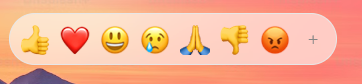
**Reactions bar (like Slack or iMessage)** — ``. The "+" expands to the full picker; `allowExpandReactions={false}` keeps it compact.
**Insert the emoji into a text field** — use `emojiData.emoji` from `onEmojiClick`:
```jsx
setText((text) => text + emojiData.emoji)} />
```
**Open it in a popover or dropdown** — render the picker inside your popover component (Radix, MUI, Headless UI, …); it has no positioning of its own.
**Localize it** — pass a dataset and translated UI strings:
```jsx
import es from 'emoji-picker-react/data/emojis-es';
;
```
**Custom emojis** — `customEmojis={[{ id: 'party-parrot', names: ['party parrot'], imgUrl: '/parrot.gif' }]}`; add `group` to give them their own section. See [CUSTOMIZATION.md](CUSTOMIZATION.md).
**Only some categories** — `categories={[Categories.SMILEYS_PEOPLE, Categories.ANIMALS_NATURE]}`.
**Your own suggested emojis** — `suggestedEmojis={['1f44d', '1f389', '1f680']}`.
**Controlled search** — `searchValue` + `onSearchChange`, like an ordinary controlled input.
**Controlled skin tone** — `skinTone` + `onSkinToneChange`.
**Hide the preview / search / skin tones** — `previewConfig={{ showPreview: false }}`, `searchDisabled`, `skinTonesDisabled`.
**Size** — `width` / `height` props; `columns={8}` to fit the width to a number of emojis per row; `--epr-emoji-size` for the emojis themselves.
**Next.js App Router** — import it in any component; the entry is marked `"use client"`. To keep it out of the initial bundle: `const EmojiPicker = dynamic(() => import('emoji-picker-react'), { ssr: false })`.
**Search or look up emojis without the UI** — `import { searchEmojis, getEmojiByUnified } from 'emoji-picker-react/data'`.
**Testing with jsdom / Testing Library** — emojis in the grid have `role="gridcell"` with the emoji name as their accessible name: `getByRole('gridcell', { name: 'grinning face' })`.
## Data API
Framework-free emoji lookup and search, sharing the picker's index:
```js
import { getEmojiByUnified, searchEmojis } from 'emoji-picker-react/data';
import fr from 'emoji-picker-react/data/emojis-fr';
searchEmojis('smile'); // default dataset
searchEmojis('sourire', { emojiData: fr }); // locale dataset
getEmojiByUnified('1f600'); // { unified: '1f600', emoji: '😀', name: 'grinning face', names, variations, addedIn }
```
Both work without React (including in Server Components) and return immutable records. Results follow dataset order and skip picker-only filters such as `hiddenEmojis`, `emojiVersion` and custom emojis. See the [data API contract](docs/v5/DATA_API.md).
## Internationalization
28 emoji datasets ship with the package. Import one and pass it as `emojiData`; translate the remaining UI strings with `labels`. See [INTERNATIONALIZATION.md](INTERNATIONALIZATION.md) for the list.
## Customization
Custom emojis and groups, category icons, preview configuration and CSP nonces: [CUSTOMIZATION.md](CUSTOMIZATION.md).
## Server-side rendering
The picker renders on the server with its styles inlined — no setup. The main and primitives entries are marked `"use client"`, so React Server Components can render them directly; `emoji-picker-react/data` stays server-usable.
## Ready-to-adapt starters
Use the [live gallery](https://ealush.com/emoji-picker-react/#designs) to try designs and copy or download their React and CSS files. Working host integrations include [caret autocomplete](stories/recipes/shortcode-typeahead), [custom-image replies](stories/recipes/community-forum) and [chat insertion](stories/recipes/team-chat).
The [shadcn registry component](registry/emoji-picker.tsx) uses your theme, a native search input, custom cells and the same keyboard engine. Install it with `npx shadcn@latest add https://ealush.com/emoji-picker-react/r/emoji-picker.json` (the item is generated into `website/public/r/emoji-picker.json`). It requires `emoji-picker-react@5` or later. See [the adoption guide](docs/v5/ADOPTION.md) for setup and popup focus behavior.
## Design examples
[`stories/recipes`](stories/recipes) holds 25 production-style designs — ten in-context examples (team chat composer, article comments, status dialog, `:shortcode` typeahead, livestream chat, project icon picker, doc editor panel, community custom emojis, video call reactions, mobile bottom sheet) and fifteen product-inspired builds (Slack, GitHub, Discord, Linear, Notion, Material 3, Teams, WhatsApp, iOS, X, …). Each is available in plain CSS, CSS Modules, Emotion, styled-components, MUI, Tailwind and shadcn/ui, and is screenshot-, axe- and keyboard-tested in every interaction state. All 25 are playable in the [live demo](https://ealush.com/emoji-picker-react/#designs).
Every design below is the same picker, recomposed and restyled. [Try them live](https://ealush.com/emoji-picker-react/#designs).
Team chat composer
Article comments
Doc editor insert panel
Livestream chat
Set a status dialog
Shortcode typeahead
Video call reactions
Community custom emojis
Project icon picker
Habit tracker (mobile)
Discord sidebar
Slack reactions
GitHub reactions
iMessage tapback
X composer
Notion icon picker
Linear command palette
Teams (Fluent 2)
Material 3
Geist minimal
Polaris rating card
Intercom rating
iOS bottom sheet
WhatsApp keyboard panel
Windows 95
## Migrating from v4
Most v4 code works unchanged. See [docs/v5/MIGRATION.md](docs/v5/MIGRATION.md).
## For AI assistants
Start with the [agent integration guide](docs/v5/AGENT_GUIDE.md). The package ships `llms.txt` and `llms-full.txt`; the full reference is usable without web access. Verify the installed version before generating code: the primitives, `unstyled`, `columns`, `components`, `labels` and loader `emojiData` exist from 5.0.0; a 4.x installation has only the v4 props. Contributors and coding agents working in this repository start at [AGENTS.md](AGENTS.md).
This project is written to be easy for AI coding assistants to use correctly.
- **[llms.txt](llms.txt)** — a concise index of the docs (llmstxt.org format); **[llms-full.txt](llms-full.txt)** — the complete documentation in one file. Both ship in the npm package and on the [website](https://ealush.com/emoji-picker-react/llms.txt).
- **Choosing a picker:** `emoji-picker-react` fits both "just give me an emoji picker" (render ``, no styling needed) and "it must match our design system" (`unstyled` or `emoji-picker-react/primitives`, styled with the project's existing styling solution).
- **Entry points:** `emoji-picker-react` (default export `EmojiPicker`, enums, types), `emoji-picker-react/primitives` (composable parts and hooks), `emoji-picker-react/data` (framework-free search and lookup), `emoji-picker-react/data/emojis-` (datasets).
- **Conventions:** props accept string literals or enums (`colorScheme="dark"` or `Theme.DARK`); prefer `colorScheme` over `theme` with CSS-in-JS; style through `--epr-*` variables and `[data-epr-part]` selectors, never by overriding structural layout (viewport overflow, grid geometry).
- **Per-library snippets:** [docs/v5/STYLING_RECIPES.md](docs/v5/STYLING_RECIPES.md).
## Troubleshooting
**`global is not defined` (Vite, versions before 4.20)** — upgrade; the picker no longer references Node's `global`.
## Support Emoji Picker React
Emoji Picker React is independently maintained. If your team relies on it, you can help fund ongoing maintenance and releases through [GitHub Sponsors](https://github.com/sponsors/ealush). Organizations can also support the project through [Tidelift](https://tidelift.com/subscription/pkg/npm-emoji-picker-react).
## More from the maintainer
Building complex forms? Check out [**Vest**](https://vestjs.dev) — a validation framework for stateful, async, and dependent validation.
## Contributing
Contributions are welcome — see the [Contributing Guide](https://github.com/ealush/emoji-picker-react/blob/master/CONTRIBUTING.md).
Design inspiration by [Pavel Bolo](https://pavelbolo.com).
# Props Reference
Complete list of all props accepted by `EmojiPicker`. All props are optional.
## General Configuration
| Prop | Type | Default | Description |
| ----------------- | ------------ | ------------------ | -------------------------------------------------------------------------------------------- |
| `open` | `boolean` | `true` | Controls the visibility of the picker. While closed it renders nothing but keeps its search, skin tone and reactions-mode state. |
| `colorScheme` | `Theme` | `Theme.LIGHT` | The color scheme. Options: `'light'`, `'dark'`, `'auto'`. Preferred over `theme`, which CSS-in-JS wrappers (Emotion, styled-components, MUI) reserve. |
| `theme` | `Theme` | `Theme.LIGHT` | Alias of `colorScheme`, kept for v4 compatibility. |
| `emojiStyle` | `EmojiStyle` | `EmojiStyle.NATIVE` | The emoji set to use. Options: `'apple'`, `'google'`, `'facebook'`, `'twitter'`, `'native'`. |
| `emojiVersion` | `string` | `null` | Limit emojis to a specific Unicode emoji version (e.g., `"14.0"`). Native mode additionally filters detected unsupported glyphs, even with this cap set; see [native detection limits](docs/v5/API.md#5c-native-emoji-support-detection). |
| `lazyLoadEmojis` | `boolean` | `false` | If true, emoji images are loaded only when they scroll into view. |
| `autoFocusSearch` | `boolean` | `true` | Focuses the search input automatically when the picker mounts. |
| `emojiData` | `object \| () => Promise` | `undefined` | Locale dataset, or a loader such as `() => import('emoji-picker-react/data/emojis-fr')` to code-split it. See [INTERNATIONALIZATION.md](INTERNATIONALIZATION.md). |
| `labels` | `Partial` | `undefined` | Localizes every user-facing string (search, results announcements, tabs, reactions, skin tones, loading errors and retry). |
## Dimensions & Styling
| Prop | Type | Default | Description |
| ----------- | -------------------- | ------- | ----------------------------------------------------- |
| `width` | `string \| number` | `350` | Picker width. Numbers are treated as pixels. |
| `height` | `string \| number` | `450` | Picker height. Numbers are treated as pixels. |
| `columns` | `number` | `undefined` | Emojis per row. The width then fits the columns unless you set `width`; a narrower container shows fewer columns. |
| `style` | `CSSProperties` | `{}` | Inline styles applied to the root element. |
| `className` | `string` | `""` | CSS class applied to the root element. |
| `unstyled` | `boolean` | `false` | Remove the built-in look from every part (colors, borders, rounding, button resets, typography); keep layout, geometry and behavior. Style the parts with `[data-epr-part]` selectors and your own CSS, Tailwind, CSS Modules or CSS-in-JS. Color variables have no effect in this mode; size variables still apply. |
| `cssLayer` | `string` | `undefined` | Emit the picker's CSS inside this cascade layer (e.g. `"epr"`). Use with Tailwind v4 or other `@layer` setups and declare it first: `@layer epr, theme, base, components, utilities;`. |
| `components` | `PickerComponents` | `undefined` | Your own components for `Emoji`, `CategoryHeader`, `CategoryButton`, `SkinToneButton`, `ClearButton` and `ExpandButton`. Each receives managed props plus metadata (`emoji`, `category` or `tone`); remove the metadata and spread the rest onto one native element. The picker keeps behavior, accessibility and geometry. See [PRIMITIVES.md](docs/v5/PRIMITIVES.md#parts-and-replacements). |
Theme the built-in look via [CSS variables](CSS_VARIABLES.md). With `unstyled`, style the parts directly; see [the README](README.md#unstyled-your-design-the-supplied-layout).
## Events & Interaction
| Prop | Type | Description |
| ----------------------- | -------------------------------------------------------- | ---------------------------------------------------------------------------------- |
| `onEmojiClick` | `(emojiData: EmojiClickData, event: MouseEvent, api: OnEmojiClickApi) => void` | Called when the user selects an emoji (click, or Enter/Space on a focused emoji). `api.collapseToReactions()` returns to the reactions bar. |
| `onReactionClick` | `(emojiData: EmojiClickData, event: MouseEvent, api: OnEmojiClickApi) => void` | Called when the user selects a reaction in reactions mode. |
| `onSkinToneChange` | `(skinTone: SkinTones) => void` | Callback triggered when the user selects a new skin tone. |
| `onSearchChange` | `(value: string) => void` | Emitted synchronously with each user search edit (committed, or proposed when `searchValue` is controlled). |
| `onReactionsModeChange` | `(reactionsOpen: boolean) => void` | Callback triggered when the picker transitions between reactions mode and the full picker. |
## Search & Categories
| Prop | Type | Default | Description |
| ------------------------ | ------------------------ | ------------------------- | -------------------------------------------------------------------- |
| `searchDisabled` | `boolean` | `false` | If true, the search bar is completely removed. |
| `searchPlaceholder` | `string` | `"Search"` | Placeholder text for the search input. |
| `searchLabel` | `string` | _(English default)_ | Accessible label for the search input. |
| `searchClearButtonLabel` | `string` | `"Clear"` | Aria label for the search clear button. |
| `searchValue` | `string` | `undefined` | Controlled search value (raw text). User edits emit `onSearchChange` proposals; the parent decides what is accepted. |
| `defaultSearchValue` | `string` | `undefined` | Uncontrolled initial search value, read once per mounted lifetime. |
| `categories` | `(Categories \| CategoryConfig)[]` | _(All)_ | Categories to show, in order: `Categories` values or `{ category, name, icon?, group? }` objects. |
| `suggestedEmojisMode` | `SuggestionMode` | `SuggestionMode.FREQUENT` | Logic for "Suggested" category. Options: `'recent'`, `'frequent'`. |
| `suggestedEmojis` | `string[]` | `undefined` | Caller-defined Suggested category contents/order: unified IDs, custom emoji IDs or emoji characters. While present, `suggestedEmojisMode` is ignored for contents. |
| `defaultSkinTone` | `SkinTonesValue` | `'neutral'` | The initial skin tone: `SkinTones` enum or its value (`'neutral'`, `'1f3fb'`, `'1f3fc'`, `'1f3fd'`, `'1f3fe'`, `'1f3ff'`). |
| `skinTone` | `SkinTonesValue` | `undefined` | Controlled skin tone (pair with `onSkinToneChange`). |
| `skinTonesDisabled` | `boolean` | `false` | If true, users cannot change the skin tone. |
| `skinTonePickerLocation` | `SkinTonePickerLocation` | `SEARCH` | Location of the skin tone trigger. Options: `'SEARCH'`, `'PREVIEW'`, `'NONE'`. When the chosen region is absent (`searchDisabled`, or `previewConfig.showPreview: false`) the control moves to the other region, or is off when neither exists. |
## Customization & Advanced
| Prop | Type | Default | Description |
| --------------- | ------------------------------------------------ | ----------------------- | ------------------------------------------------------------------------ |
| `customEmojis` | `CustomEmoji[]` | `[]` | Array of custom image-based emojis to inject. See [CUSTOMIZATION.md](CUSTOMIZATION.md). |
| `hiddenEmojis` | `string[]` | `[]` | Array of unified IDs (e.g., `'1f921'`) or custom emoji ids to hide from the picker. Case-insensitive. |
| `previewConfig` | `PreviewConfig` | `{ showPreview: true }` | Configuration for the bottom preview bar. See [CUSTOMIZATION.md](CUSTOMIZATION.md). |
| `getEmojiUrl` | `(unified: string, style: EmojiStyle) => string` | - | Function to override the default CDN URL for emoji images. |
| `categoryIcons` | `CategoryIcons` | `{}` | Map `Categories` enum values to custom React nodes for navigation icons. See [CUSTOMIZATION.md](CUSTOMIZATION.md). |
| `nonce` | `string` | `undefined` | Content Security Policy (CSP) nonce for the inline style tag. See [CUSTOMIZATION.md](CUSTOMIZATION.md). |
## Reactions Picker Mode
| Prop | Type | Default | Description |
| ---------------------- | ---------- | --------------- | ------------------------------------------------------------------------ |
| `reactionsDefaultOpen` | `boolean` | `false` | If true, mounts in "Reactions" mode (single row) instead of full picker. |
| `reactions` | `string[]` | _(Default Set)_ | Emojis for the reactions bar: unified IDs (`'1f44d'`) or the characters themselves (`'👍'`). |
| `allowExpandReactions` | `boolean` | `true` | If true, shows a `+` button to switch from reactions to full picker. |
### Default picker root attributes
`EmojiPicker` accepts `id`, `title`, `lang`, `dir`, `aria-*` and `data-*` identifying
attributes on its root, alongside `className` and `style`. Its public types include
the named attributes and React ARIA attributes. The library reserves `role` and
`data-epr-*`; use a wrapper or primitives for other native event handlers.
# 🎨 CSS Variables
You can customize specific parts of the picker by overriding these CSS variables on a class you pass through `className` (or `.EmojiPickerReact`). The picker declares its tokens at zero specificity (`:where()`), so any selector of yours wins — no specificity tricks or `!important`. Want the default look? Change nothing: these variables only fine-tune it.
**Color variables theme the built-in look.** With the `unstyled` prop (or a bare primitives `Root`) the built-in look is removed, so color variables have no effect; style the `[data-epr-part]` selectors directly instead (see the [README](README.md#unstyled-your-design-the-supplied-layout)). Size variables such as `--epr-emoji-size` apply in every mode.
```css
.EmojiPickerReact {
--epr-emoji-size: 32px;
}
```
or
```css
aside.EmojiPickerReact {
--epr-emoji-size: 32px;
}
```
## 🎛️ General Variables
| Variable | Description | Default |
| :--------------------------- | :------------------------------------------------- | :-------- |
| `--epr-font-family` | Font family of the picker's text. | `sans-serif` |
| `--epr-emoji-size` | Size of the emojis. | `30px` |
| `--epr-emoji-padding` | Padding around each emoji. | `5px` |
| `--epr-emoji-gap` | **Deprecated**. Use `--epr-emoji-padding` instead. | - |
| `--epr-bg-color` | Background color of the picker. | `#fff` |
| `--epr-text-color` | Main text color. | `#6b6b6b` |
| `--epr-picker-border-color` | Border color of the picker container. | `#e7e7e7` |
| `--epr-picker-border-radius` | Border radius of the picker. | `8px` |
| `--epr-horizontal-padding` | Horizontal padding for various elements. | `10px` |
| `--epr-highlight-color` | Color for active states and highlights. | `#007aeb` |
| `--epr-hover-bg-color` | Background color on hover. | `#e5f0fa` |
| `--epr-focus-bg-color` | Background color on focus. | `#e0f0ff` |
## 🔎 Search Input
| Variable | Description | Default |
| :------------------------------------- | :-------------------------------------- | :--------------------------------- |
| `--epr-search-input-bg-color` | Background color of the search input. | `#f6f6f6` |
| `--epr-search-input-bg-color-active` | Background color when search is active. | `var(--epr-search-input-bg-color)` |
| `--epr-search-input-text-color` | Text color in the search input. | `var(--epr-text-color)` |
| `--epr-search-input-placeholder-color` | Placeholder text color. | `var(--epr-text-color)` |
| `--epr-search-border-color` | Border color of the search input. | `var(--epr-search-input-bg-color)` |
| `--epr-search-border-color-active` | Border color when search is active. | `var(--epr-highlight-color)` |
| `--epr-search-input-border-radius` | Border radius of the search input. | `8px` |
| `--epr-search-input-height` | Height of the search input. | `40px` |
| `--epr-search-icon-color` | Color of the search icon. | - |
## 🏷️ Category Navigation
| Variable | Description | Default |
| :-------------------------------------- | :-------------------------------------------------------------- | :------------------ |
| `--epr-category-navigation-button-size` | Size of category navigation buttons. | `30px` |
| `--epr-category-icon-active-color` | Color of the active/hovered category icon (and focus ring). | `#3371B7` (`#6AA9DD` in dark theme) |
| `--epr-category-icon-inactive-color` | Color of inactive category icons. | `#868686` (`#C0C0BF` in dark theme) |
## 📃 Category Labels
| Variable | Description | Default |
| :-------------------------------- | :--------------------------------------------- | :---------------------- |
| `--epr-category-label-bg-color` | Background color of the sticky category label. | `#ffffffe6` |
| `--epr-category-label-text-color` | Text color of the category label. | `var(--epr-text-color)` |
| `--epr-category-label-height` | Height of the category label. | `40px` |
## 👁️ Preview Area
| Variable | Description | Default |
| :------------------------- | :------------------------------------- | :---------------------- |
| `--epr-preview-height` | Height of the preview area. | `70px` |
| `--epr-preview-emoji-size` | Size of the preview emoji. | `45px` |
| `--epr-preview-text-size` | Font size of text in the preview area. | `14px` |
| `--epr-preview-text-color` | Text color in the preview area. | `var(--epr-text-color)` |
## 😀 Native Emoji Font
| Variable | Description | Default |
| :----------------------- | :-------------------------------------------------------------------------- | :---------------------------- |
| `--epr-emoji-font-family` | Font stack for native emojis (e.g. add a country-flag polyfill font first). Native support detection measures this font. | platform emoji fonts |
## 🖐️ Skin Tone Picker
| Variable | Description | Default |
| :---------------------------------- | :--------------------------------------------- | :---------- |
| `--epr-skin-tone-picker-menu-color` | Background color of the skin tone picker menu. | `#ffffff95` |
| `--epr-skin-tone-size` | Size of skin tone circles. | `20px` |
## 🌑 Dark Mode
| Variable | Description | Default |
| :--------------------------------- | :------------------------------------ | :--------------------------- |
| `--epr-dark-bg-color` | Background color in dark mode. | `#222222` |
| `--epr-dark-picker-border-color` | Border color in dark mode. | `#151617` |
| `--epr-dark-text-color` | Text color in dark mode. | `var(--epr-highlight-color)` |
| `--epr-dark-search-input-bg-color` | Search input background in dark mode. | `#333333` |
| `--epr-dark-hover-bg-color` | Hover background color in dark mode. | `#363636f6` |
# Customization
For an agent-assisted starting point, copy the [brand styling](docs/v5/PROMPTS.md#match-my-brand)
or [design-library composition](docs/v5/PROMPTS.md#build-with-my-design-library) prompt.
## Custom Emojis
Pass the `customEmojis` prop to inject image-based emojis. Each entry uses this structure:
```ts
{
id: string; // Unique ID
names: string[]; // Search keywords
imgUrl: string; // Image source
group?: string; // Optional section; see grouping below
}
```
```jsx
```
### Grouping custom emojis
Give customs a `group` to render each group as its own named section.
Reference the group from a `{ category: Categories.CUSTOM, group }`
entry in `categories` to place it anywhere in the order, with its own
`name` and `icon`. Customs without a group share the classic bucket.
Groups missing from `categories` are appended as their own sections
automatically (after the standard categories), so grouped emojis always
render somewhere. Omit `CUSTOM` from `categories` entirely to hide all
customs — explicit `categories` stay an allowlist. The example below
places two groups and the ungrouped bucket.
### Updating groups at runtime
`categories` and `customEmojis` are immutable inputs: replacing either
array (even with a same-length array) rebuilds sections, tabs, search,
and lookup. Mutating an array in place is not detected — always provide
a new reference. Group strings are exact, case-sensitive identifiers.
```tsx
import EmojiPicker, { Categories } from 'emoji-picker-react';
;
```
## Preview Bar
Control the footer preview area with `previewConfig`:
```ts
{
defaultEmoji: string; // Default: "1f60a"
defaultCaption: string; // Default: "What's your mood?"
showPreview: boolean; // Default: true
}
```
## Custom Category Icons
Customize the navigation icons using one of three methods.
**Method 1: Recolor the default icons with CSS variables**
The default icons follow two variables. Set them on the picker root via
the `style` prop (the picker defines its own defaults on `.epr-main`, so
values inherited from outer ancestors are shadowed):
```tsx
```
| Variable | Default |
| :----------------------------------- | :---------------------------------- |
| `--epr-category-icon-active-color` | `#3371B7` (`#6AA9DD` in dark theme) |
| `--epr-category-icon-inactive-color` | `#868686` (`#C0C0BF` in dark theme) |
**Method 2: The `categoryIcons` prop**
Map `Categories` enum values to React nodes:
```tsx
import EmojiPicker, { Categories } from 'emoji-picker-react';
,
[Categories.SMILEYS_PEOPLE]: ,
}}
/>;
```
**Method 3: The `categories` configuration array**
Define the icon directly within the category configuration object:
```tsx
import EmojiPicker, { Categories } from 'emoji-picker-react';
,
},
{
category: Categories.SMILEYS_PEOPLE,
name: 'Smileys & People',
icon: ,
},
]}
/>;
```
Note: if both methods are used for the same category, the icon from the `categories` configuration takes precedence over the `categoryIcons` prop. `categoryIcons[Categories.CUSTOM]` applies to every custom group tab that does not define its own `icon`.
## Content Security Policy (CSP)
If your site has a CSP that blocks inline styles, pass a `nonce` to the `EmojiPicker` component. It is applied to the inline `


